 Headache- Inducing- Evil.
By: Raistlenn
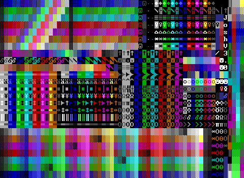
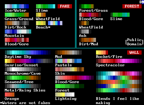
Dark red line walls keep things looking muted which honestly helps. Stats are saved by replacing things like red lions and cyan tigers with X characters. Everything is numbered for a good compromise of sacrificing space while allowing more unclear elements to be understood. I've honestly never seen this one before, but it seems pretty smartly designed. It even beats out tboT's grey-line for an even more legible arrangement of thin white lines (and its half-blocks)! This does come at the cost of it taking a lot more space, making it yet another trade-off really.
Perhaps my one complaint is that the half-block text characters are arranged in a way that at a glance I thought there was a band of white solids running across the screen rather than bottom and top half-blocks next to each other.
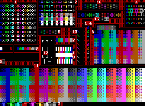
 HSGI Coloring Kit (v4)
By: PresHGSI
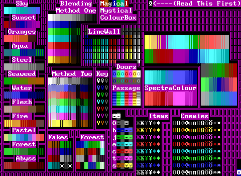
Again the dark linewall colors make the mess more pleasing to the eye.
There's an odd choice to dedicate so much space to the pre-made blends rather than just the typical row/column of tiles. It does give a much better idea of what these blends can make a board look like though, but probably isn't worth the loss of space.
Good coverage on most elements, though some of the colors are a bit unusual. The default enemies being made available in white, grays, dark red, and dark blue is very unusual. Those passages are also a very strange mess, with two different sections and one being labeled as being "with stats" although both groups have stats. (Statless passages always lead to the title screen and are pretty pointless outside of decoration in an area the player can't access.)
I am going to call foul on the "2nd players" section. Those players have stats and aren't dummies, which means they'll revert to white on dark blue as soon as they get a tick and ZZT resets the color/character upon seeing there's no active energizer. These should just be dummies or "breakable smilies" as this kit calls them in order for them to be of any use.
Lastly, the bombs on the verge of exploding are an uncommon but useful tool, though this is something where you likely would rather have matching foreground/background colors in order to hide them better for an explosion in a cut-scene or something.
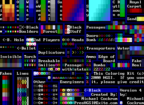
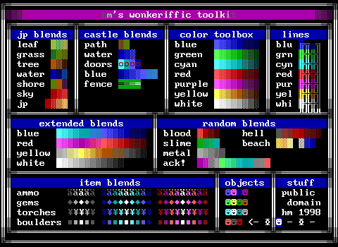 hm's wonkeriffic toolkit
By: hm
Very clean! This one is incredibly readable, but doesn't offer a whole lot. The focus on "castle blends" makes me think this was made with a specific purpose in mind. The "doors" blend under that category is bizarre to me.
The scroll also reveals that all of these blends were made by hm, openly admitting that several of them are probably extremely close to or identical to ones others have already made. I admire the commitment to only using original work even if the culture of ZZT meant that anything in tool kits was already free to use. (Well, other than the AKWare quiz apparently.)
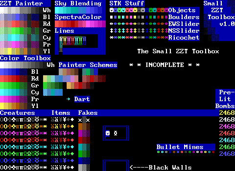 Jacob Hammond's Colorkit/Small ZZT Toolbox v1.0
By: Jacob Hammond
Lots of empty space, and very few blends available, but there are a large amount of the different built-ins represented. This seems like a good toolkit for making a ZZT world in the mid-90s. The pre-lit bombs have a wider range of values, but still lack "stealth" colors. We also get to see "landmines", which ideally are made with statless bullets so they sit still and will still harm the player if stepped on. A less practical equivalent are bullets that still have stats, but set to cycle zero so they never get a chance to act. Hammond here is properly using statless bullets. Good work.
This kit includes one already coded object to use in your worlds, a dart object that is extremely buggy. It's almost impressive. The dart tries to move north once, and if it can, and if it's then aligned, it instantly explodes and becomes a fake wall. Doing this prevents it from executing more code to play a sound effect and cause a game over. If the dart can't move north, or it can but it's not aligned with the player, it will just halt execution and be harmless as well. This is not something anybody importing this tool kit will ever want to use.
 JM's All Purpose ZZT Toolbox
By: JM
I'm not feeling this one. There's very little here, lots of empty space, and it just feels incomplete to me. This seems less like a tool kit and more like some scratch pad that got some labels applied to it.
The weird alternating pattern with the fake walls seems like it would make it take longer to find a specific fake as you can't memorize which column has the matching foreground and background and which column has black on a dark background. There's just really not much here, even the blends are pretty much just going from color A to B to C rather than meant at evoking some kind of theme.
 Knightt's Pointless Color Kit 1.0
By: Knightt
I think this is what JM's toolbox wishes it was. It's still got a good amount of unused space, but feels far more deliberate to me. Even the blends all have a clear purpose in which they'd be used.

The KjKit!
By: Kjorteo
Ah, now we've reached one of the most impressive tool kits. Kjorteo's kit takes a whopping three whole boards, but offers a ton of options.
ZZTers were fairly divisive on toolkits that took multiple boards. KjKit probably does it best though due to the sheer amount of stuff on it. Typically, your tool kit will be able to put what you'd consider "essential" on one board, and anything that didn't fit would be used rarely enough that you wouldn't mind just grabbing the missing tile out of Super Tool Kit or another tool kit and placing it directly in your game. Having multiple boards does mean having to remember which board has what and that can be a bit annoying. Despite my own issues with multiple board tool kits, this one definitely put some thought into the pros and cons of having more than one board.
The space here is incredibly optimized, breaking everything up into basically a 3x3 grid and then cleanly splitting up a 10th element type into two halves with the remaining space on the right. Sure you could argue that there's this small rectangle remaining, but overall this kit manages to excel in both readability and content. There's definitely something to be said about a kit that's designed to be multiple boards from the start rather than organically growing from one board to two and then three.
The only thing I could think of to improve it, is that it doesn't contain board edges. These are hardly essential, but since they have an invisible character and thus only appear as a background color that tiny pocket on each board could easily include them and just squeeze that tiny bit more into the space.
Perhaps one other "flaw" might be that the elements included on each board make it so that you really would want all three imported. I think if you took the invisibles on board three and exchanged them for the line walls on the first board, you'd be able to get away with just using boards two and three in a lot of cases. This kit is definitely intended to be three boards though, and I'm really just splitting hairs. Perhaps my complaints held more weight back when tool kits were actually a critical part of making a ZZT world, and now in these days of effortless STK it's easier both to nitpick and to say "yeah sure three boards is fine".
 K Z T - Color Kit
By: Unknown
Something about this one is weirding me out. The way the colors are arranged is really strange. There's a pattern to it, but alternating dark + light and then light + dark makes it hard to focus on? And then each row alternates which of the two patterns it starts on as well. I'm not big on this one and that's without even getting into the lower half of the board which is almost empty except for some statless elements that feel tossed in as a novelty.
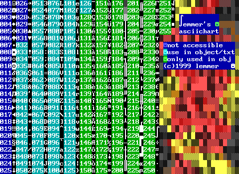 Lemmer's ascii chart on fire
By: Lemmer
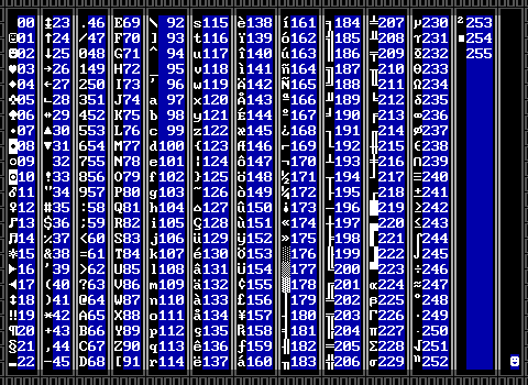
Excuse me, this is not a tool kit. This is an ASCII chart. They're not nearly as common as tool kits, but you'll find plenty of them in actual released worlds. The default ZZT editor straight up does not tell you what number a character is assigned forcing you to guess your #char commands and adjusting from there. If you grew up on ZZT you probably have a handful of these memorized.
This one categorizes them into three kinds as well: the first block which cannot be typed in scrolls/objects/text without modifying the world or using an external editor; the second which is the standard set of typeable characters; and the last set which is "only used in objects" which is incorrect. You can type any character from 127 and beyond with alt-codes. The ZZT Encyclopedia has an old reference for many of them..
There are also some old DOS utilities that are unrelated to ZZT that run in the background and let you bring up an ASCII chart (for programming I'd imagine) by hitting a certain combination of keys. Really though I think most people just kind of learned a handful of characters and would count/guess their way from something they knew to where they were aiming for. Additionally, the unofficial ZZT Help file Update provides a chart that can be readily referenced from within ZZT's editor.
 lemmer toolkit: v100
By: Lemmer
This is a bit more straight forward, and again looks rather familiar. It's a decent set all things considered, but at this point it's not bringing anything new other than a very tediously made linewall border.
 MadTom's ZZToolKit
By: MadTom
Here's a nice one. MadTom's got two kits in Z-Files with two different focuses. This one is all about offering raw elements. You get the large color fades that take up a huge chunk of space on the bottom and fakes up top that are 90% of what you need to begin with. Then you get the surprisingly underrepresented combinations of forests in the center by the linewalls, as well as colored empties which are useful in that if you #put something on top of one without specifying a color, it will use the color of the empty. This sort of thing is seldom used, and definitely debatable if it's worth taking up all that space, but what MadTom includes here doesn't really leave me wishing the space was used for something else.
Also I mentioned odd choices of passage colors in a few other kits, but I think this one absolutely nails it. These are the color combinations you'd be after for special colored passages in most situations.
This one is also a product of its time as it mentions in its little FAQ that you shouldn't be using STK lions and tigers and things because you're better off programming your own enemies. This was a very common sentiment in the 2000s and you can likely roughly date most toolkits by how many prefab enemies they included.
 MadTom's ColorKit
By: MadTom
Splitting hairs on tool kits and color kits and fades and shades and schemes. MadTom simply opts to make two boards with this second one essentially serving as a shortcut versus having to put all these things together bit by bit from his tool kit.
I think at this point, all the named fades have been seen before, but I'm greatly amused by the "Seaweed/Tree" label.
This is also the first instance (at least that I noticed) of fades being designed to be made out of forests.
 Magical Mystical ColorBox
By: Deep Purple
Seeing this is giving me a weird sense of familiarity like there was a time when I used this, but we've already seen Colors R' Us and we've yet to see S.N.A.C.K. which I absolutely did use prior to making my own.
Hey. How come so many kits have the same sort of shared error with the green water part under "Method Two"? Why are these all slightly off? It's not uncommon for tool kits to start by taking an exiting tool kit and then deleting 90% of it, leaving one section behind to save from having to copy it over tile by tile. (This will become apparent when we reach "Shades Toolbox".) Even if this mistake was constantly being copied from some other tool kit, why did nobody take the two seconds to fix it? I hate it. I keep thinking maybe it's actually supposed to be a smoother fade from light to dark, but if that were the case it should be the same for ever color, and then yellow is just a total mess every time we see this sort of thing.
Lots of forest tiles though. I approve of that.
But also a whole set of dark gray keys which are both redundant, and not all that great since dark gray keys are considered black keys which ZZT doesn't handle properly, resulting in a glitchy message and giving the player 256 gems on collecting them. They're rarely used for that reason. Luckily this kit has so much empty space that it doesn't matter.
 Mega Color Box '98
By: XAbbott
See, this is what I'm talking about. Painter schemes has the flipped green tiles. The "black wall" is just pressing the space character with white text and thus can't even be referenced in ZZT-OOP. I'd have guessed this kit was much earlier if the title didn't say 1998. Its got the same limited set of forests taken straight from STK and the same blends you see in pretty much everything.
It does offer STK doors with bright-on-dark colors which is definitely vastly superior to ZZT's standard door design, so there's still something to like.
Strange inclusion of blinking line walls. I like the weird sort of panic in the corner of them where the author realizes that they can't cleanly fit everything with the layout they designed.
 MIG toolkit
By: Commodore
The fades are broken up with text which makes it far easier to focus on them. There are a lot of text characters available for making various line art. It even has a monitor, which is incredibly pointless to actually have in your kit. (Monitors replace the player on the title screen and handle keyboard input for opening the world menu, playing, or editing the game. There's no practical use for them other than causing things to break if certain keys are pressed.)
And my god, the half-block characters. It's beautiful. You can instantly tell which way the block is arranged, and there are no pseudo-solids where two opposite directions touch. This is it. You can't arrange them better than this.


Misteroo Rebellion/AKWare Toolkit
By: Misteroo
This is like a proto-KJKit in structure. The space used isn't exactly maximized, but it's all very clearly grids of elements in every combination or at least every non-blinking combo.
The second board continues what's been established and uses its leftover third of a board for some quick fades and a joke about anal sex. What's not to love?
Plus it includes green on dark cyan breakable under "Skin?".
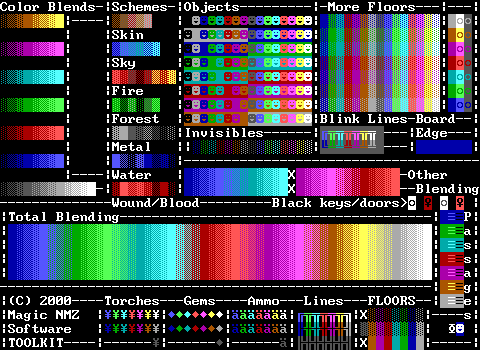 MNMZ Soft Toolkit v1.3
By: NMZmaster
Not bad. It's clean, yet still striking with its "total blending". It looks nice, but ultimately is lacking quite a bit in color combinations for walls. There's a deliberate shift with the object background colors that I actually kind of like as it gives the illusion of there being two groups of objects, those with special foreground colors and those without. It might actually make it easier to parse visually when looking for a specific color of object.
 Mondo SaxxonPike ToolBox
By: SaxxonPike
Very packed. It claims to have every color combination of walls which I'm inclined to believe with how much space it all takes up, but it's always so much harder to parse color layouts like those. Contrast it with the large portion of line walls in the lower right which to me is significantly easier to find something specific in.
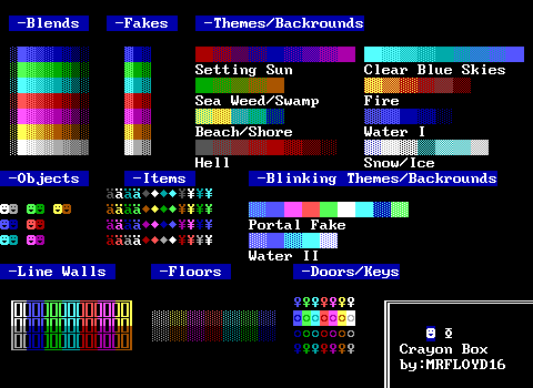 MRFLOYDS COLOR BOX / Crayon Box
By: MRFLOYD16
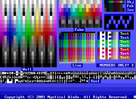 Mystical Winds TK - Art Set Advanced.
By: Nanobot
Lol this one threatens you to be prosecuted by law if you use this and are not a member of Mystical Winds.
That kind of steals the show, but otherwise you'd have an interesting sort of arrangement of colors that looks very distinct from anything else. It also includes some practical text with both half blocks and the standard wall fade. Plus a proper set of white text excluding typeable characters.
Unfortunately I cannot recommend this tool kit because I don't want to see anybody have to make a court appearance.
 Mystickcal Color Toolkit
By: Myst
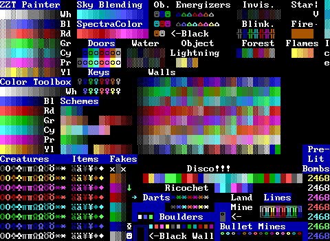
Our painter colors are looking even more messed up than usual here. I wish I knew what was going on with all of these. This one isn't doing anything too unusual at first glance, but it has a few oddities. For one, the broken dart seen earlier is back, along with a new dart which works, but is even less practical. It waits a set amount of time and then walks south until it hits something, before it harmlessly explodes, surrounding and transforming itself into fake walls.
What's distinct about this one is the giant "Disco!!!" area. Lots of kits include "disco floors", but they're usually just that, floors made of fake walls. This one here is just an ultra colorful blend of sorts that gets very drab looking in the middle as it goes through a gray/dark cyan section for some odd reason.
Also the boulder section is killing me because it doesn't fit well so the author added in some extras, but these also include plain old boulders that the ZZT editor will gladly make.
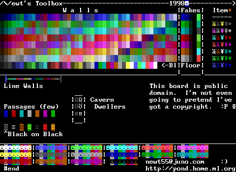 Newt's Toolbox
By: Newt
That diagonal layout returns, but seems to be expanded even more. Having the basic colors in the bottom row does make it a bit easier to parse the diagonals a bit though.
Credit given towards the "Item" area in the top right. Ammo and torches are normally locked to a single color and Newt sets things up so that you get fourteen new colors, ignoring the default and black. Except then he has gems where there needs to be eight new colors, leading to a brown gem just being tossed at the top of the area.
Referring to gray lions/tigers/bears as "cavern dwellers" is cute themeing.
Newt also takes a more thorough approach with objects, including a whopping 128 of them, the full non-blinking set. This drastically limits available stats, and is likely why so much of the board is empty.
 NMZMaster Toolkit v3.0
By: NMZmaster
Oh now this is clean looking. This is incredibly aligned to a grid and offers 128 varieties of the critical components. Though at the same time this is likely why light gray items are missing. However, the fact that even the blend section fits so nicely makes me thing its an acceptable loss. I've been pretty negative on blends like these that are just running into each other like this, but NMZMaster seems to have taken pretty good care to have abrupt contrast changes which prevents the blends from, uh, blending into each other.
Actually this is just a major redesign of NMZmaster's previous kit. It improves on the old one immensely and to the point where you wouldn't even make the connection that they're actually the same tool kit. Good work NMZmaster. I think you tricked Nadir into including two versions of one tool kit.
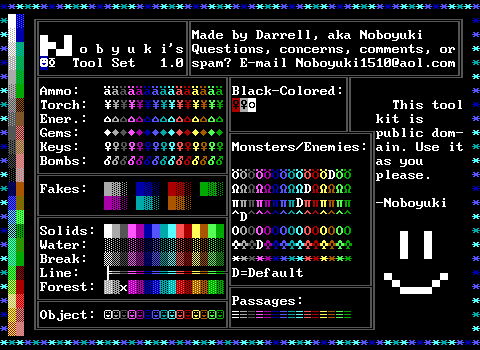 Noboyuki's ToolSet
By: Noboyuki
Points are being deducted for the author spelling their name wrong. The scroll claims it to be the "ultimate toolkit" and I strongly disagree. This one is highly focused on items and creatures, which has its uses, but there's a tremendous lack of walls available.
Y'all it's missing "normal walls". This thing is just barely scraping by due to its cool ricochet border and general rainbow aesthetic that makes it pleasing to look it, but very poor to actually work with.
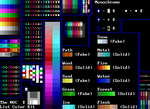 The NOC Color Kit
By: Ethan Hunt
Powerful branding with that amazing floppy disk logo. Aside from that, this one is pretty average. There's a good arrangement of built-ins, and the basic bright to dark fades with walls, but a lot of the space is wasted. This kit does include blink wall rays in lower right which haven't been too common and can be a great stat saver when linewalls don't quite work due to them connecting to the edge of the board. It also has those half-block text characters and some "windows" up top.
It does have an actual guide to how things appear in ZZT's monochrome mode, but this is a point of accuracy that rarely matters, and is information that would have been better submitted to the ZZT Encyclopedia rather than taking up a surprisingly large portion of a tool kit. Although with how much space is empty, it might be so large just so the space actually gets used.
 /\/omo(7) update!
By: Coolzx
A bit too messy for my tastes. There's just a little bit of everything and not much depth available except for objects.
Still, it's not hopeless, as the inclusion of the "slants" gives a more concrete example of what kind of angles can be made with half block characters. I'm also fond of the colors in the top left breaking away from the usual ZZT order and going with an RGB and PCY arrangement divided by white.
But then it does things like "c is do" and "hey don't use yellow borders/text" which are just weird bits of information to include. Anybody who is at the point of using tool kits almost certainly won't need to be told these things.
Bonus points for the seasonal blends though.
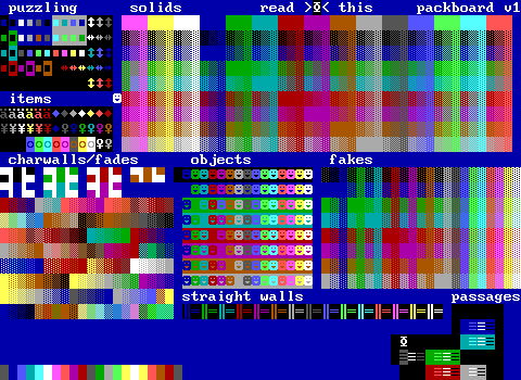 Packboard v1
By: aetsch
Puzzling from the start. The color choices on a lot of these elements are very limited. Sliders are available in nine colors, and three of them are normal ZZT colors to begin with. The boulder options are even more strange with dark blue and light gray backgrounds and still very limited palettes with several duplicates.
Packboard is a good example of having to consider what stat elements get included. The large 128 options for objects causes problems where there aren't enough stats to finish the section of passages, resulting in just a few colors being available. This is where shaving off non-essentials like the objects with matching foreground and background colors can really help out.
 Paranoid Machinations
By: Zenith Nadir
This one is a favorite of mine for a few reasons. For one thing, Nadir clung to tool kits over external editors for significantly longer than most. There's a lot of love put into it to ensure that even as densely packed as it may be, that it retains readability. I love that the pushers are alternating between pointing up and down. There are tons of elements represented here, from statless bombs and blink wall rays to some text in the top right meant to look like broken glass. The usual arrangement of walls is just being consumed by various items and statless enemies, which I absolutely do not understand. The objects are differentiated from the dummy players by using music notes for their character.
But what makes Paranoid Machinations so special, is that it's been shuffled around so many times that it's begun to fall apart. Look to the lower right corner, a little bit above the "the end text" and you'll find a purple on gray equals sign. This is a bomb with its fuse set to a non-standard value resulting in it displaying an unusual character. This is such a bizarre inclusion that I can't believe it to be intentional, and it's made even stranger by the tile to the left of it, which isn't even a defined ZZT element, but rather whatever ZZT happens to go with when you tell it to draw "element 246". I swear I've found an earlier version of this kit in some other game that lacked these oddities.
Oh, it also has a statless yellow on dark blue duplicator towards the top right which makes for a good "star in the sky" tile without burning a stat or having to rely of placing a linewall with no other linewalls surrounding it.
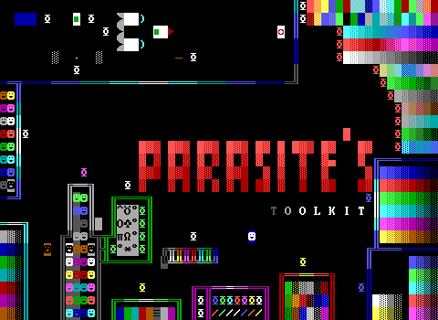 PARASITE'S TOOL KIT
By: Parasite
This one saves space by using scrolls instead of text to label its fades and well, every element. Of course, this gains space at the cost of stats, and there's a ton of space to spare here. This one is definitely more interested in having some quickly accessible objects rather than a ton of fades or elements. However, most of these objects seem pretty impractical. There's the classic ZZT mirror object that turns into a smiley face when the player is next to it, and a single brown door object that doesn't have a vertical alternative available. Then there's a large rocket to interact with that seems like it's not going to have much use. Lastly are some computers which just have some pre-made menus that I guess save on some typing, but again don't feel all that essential.
Not a fan of this.
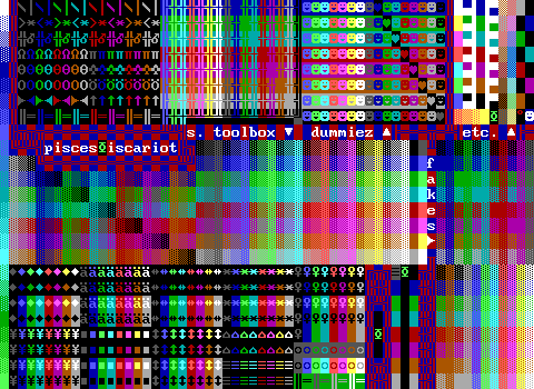 pisces~iscariot version 666
By: jujubee
By this point you probably have a feel for these things, and likely won't be surprised when I say that pisces~iscariot can be found in numerous ZZT games out there. This one is really packed, and has some good space saving techniques, replacing not only matching colored dummies with dark objects, but doing the same thing in its main fade section, opting to not bother with things like "dark cyan on dark cyan breakables" or whatever.
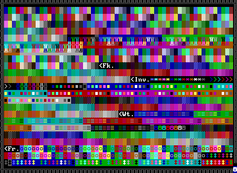
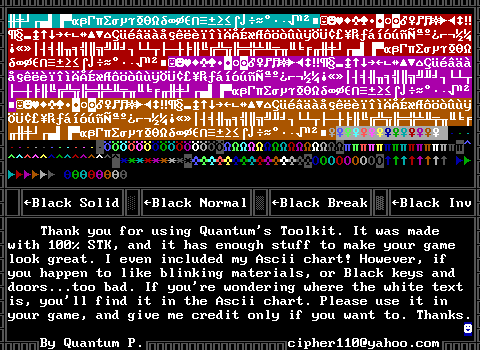
By: Quantum P.
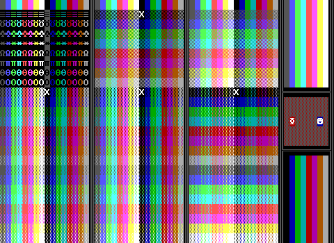
Calm down Quantum. KJKit took things to three boards, but Quantum says "ASCII charts count" and creates this four board monster. It takes a very simple approach to its layout of just going left to right and not caring about what kind of a mess it looks like in the end. Despite the chaos though, knowing there's just a straightforward foundation to its layout means that you probably can learn your way around this kit with a little bit of time. That first impression though, is extremely intimidating on the first board.
Once you move to the second board, things get far more legible as the contrast between elements is increased dramatically versus the walls of the first board which... blend... together.
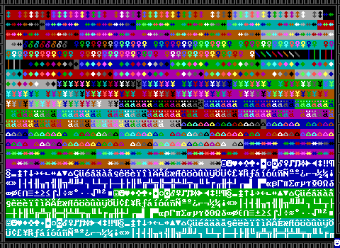
Really the only reason this one takes more than two boards is because it includes a full set of (non-typeable) text. Get rid of that and you'd be able to include the various creatures on the third board on the second instead. The kit itself also explains that the missing white text can just be obtained on the ASCII chart board. Sensible.